8. Designing an effective web based user experience
‘Experience’ – this word is probably important in every way of life also when we want to create a web page. It is simple to understand because try to imagine what is better for you and for potential customers – simple web page or complex web page? The answer is obvious. If you want to create a really good and simple web page you should read about few factors which can be helpful for you in this case. When we talk about web page we talk about whole structure and about whole design. Structure, colors, size, etc. does matter. When we have our web page ready and everything works we should analyse our ‘product’. If we do analysis we can have a lot of information which can improve final product which is web page. We can improve small parts of our web page or we can change something designs, methods or techniques but until we do not have analysis we are not able to know that something does not work and we should change it.
1.1 Explain the principles of a web-based user experience
User Experience Basics
Vitaly Friedman from the smashingmagazine has a good definition od user experience (UX) focuses on having a deep understanding of users, what they need, what they value, their abilities, and also their limitations. It also takes into account the business goals and objectives of the group managing the project. UX best practices promote improving the quality of the user’s interaction with and perceptions of your product and any related services.
Factors that Influence UX
At the core of UX is ensuring that users find value in what you are providing to them. Peter Morville represents this through his User Experience Honeycomb.

He notes that in order for there to be a meaningful and valuable user experience, information must be:
- Useful: Your content should be original and fulfill a need
- Usable: Site must be easy to use
- Desirable: Image, identity, brand, and other design elements are used to evoke emotion and appreciation
- Findable: Content needs to be navigable and locatable onsite and offsite
- Accessible: Content needs to be accessible to people with disabilities
- Credible: Users must trust and believe what you tell them
Areas Related to Building the User Experience
UX is a growing field that is very much still being defined. Creating a successful user-centered design encompasses the principles of human-computer interaction (HCI) and goes further to include the following disciplines:
- Project Management focuses on planning and organizing a project and its resources. This includes identifying and managing the lifecycle to be used, applying it to the user-centered design process, formulating the project team, and efficiently guiding the team through all phases until project completion.
- User Research focuses on understanding user behaviors, needs, and motivations through observation techniques, task analysis, and other feedback methodologies.
- Usability Evaluation focuses on how well users can learn and use a product to achieve their goals. It also refers to how satisfied users are with that process.
- Information Architecture (IA) focuses on how information is organized, structured, and presented to users.
- User Interface Design focuses on anticipating what users might need to do and ensuring that the interface has elements that are easy to access, understand, and use to facilitate those actions.
- Interaction Design (IxD) focuses on creating engaging interactive systems with well thought out behaviors.
- Visual Design focuses on ensuring an aesthetically pleasing interface that is in line with brand goals.
- Content Strategy focuses on writing and curating useful content by planning the creation, delivery and governance behind it.
- Accessibility focuses on how a disabled individual accesses or benefits from a site, system or application.
- Web Analytics focuses on the collection, reporting, and analysis of website data.
1.2 Explain how website elements affect user behaviour
Joe Rinaldi from the impactbnd writes interesting things about how website elements affect user behaviour.
“Mobile web browsing overtakes desktop for the first time!”
Two years ago that headline was plastered across some of the most popular blogs in the industry. Today, we’re still in the midst of the mobile revolution and it shows no signs of slowing down.
For the first time ever mobile browsing has begun to lead the way we design for desktops.
With adults expected to spend an average of 3 hours and 23 minutes on voice mobile media, it’s no surprise to see the features we use every day making their way over to their stationary counterparts on desktop.
Being able to understand these mobile behaviors and how to effectively implement them in your web design can make a huge impact on your sites user experience.
Using features and trends people are familiar with eliminates a lot of the guesswork someone will need to do when using your site.I’ve compiled some of the top mobile trends below to help give you a headstart on what exactly you should look into implementing on your site.
1. Hamburger Menus
Love them or hate them, hamburger menus are one of the most noticeable elements to make the jump from mobile to desktop.
If you’re not familiar with hamburger menus, it’s the name UI/UX designers use to refer to the triple bar icon some sites use in lieu of a traditional navigation menu.
While there’s plenty of arguments to be made for and against the use of hamburger menus, it all really boils down to the goals of your site and how you choose to implement it.
When done correctly, hamburger menus present users with a clean unobtrusive layout that lets them focus on the page’s content. Hamburger menus also eliminate “decision fatigue” or “analysis paralysis” which occurs when people are presented with too many options on a page.
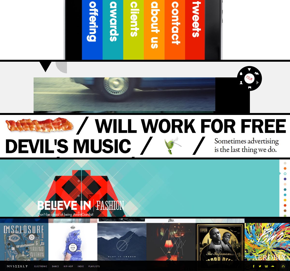
Below, design agency, Telepathy uses a nice combination of the hamburger menu and a traditional menu to create a clean UI.

They feature the most important links in their nav bar while neatly tucking away additional links in the hamburger menu. This approach does a really nice job setting a clear path for users to follow.
2. Sticky Elements Moving to the Bottom of Pages
Sticky elements are those that appear to be “stuck” to a specific part of a page.
While these are nothing new in web design, we usually see them at the top of a page. These elements can include things like sticky headers, cookie disclaimers, or “hello” bars promoting an offer.
The growth in mobile browsing has led to people designing with a special consideration for something known as the “thumb zone.”
This refers elements of a page that are easily accessible by a user’s thumb.
With this in mind, elements began to move from the top of the page down to the bottom so they could be clicked more easily.
Facebook, for example, does a great job of designing for the “thumb zone.”
In the screenshot below you can see they moved all of their apps navigation items to bottom of the screen. This gives them more attention and makes the links easier to click.

Not only does this approach give users that feeling of familiarity that I mentioned before, it also provides a less distracting way to promote a message or offer.
The typical user reads from top to bottom, so placing these elements on the bottom of a page allows people to focus on the content, then interact with it easily if they’re ready.
The example below shows how Medium uses a sticky element on the bottom of the page to show users how many free reads they have left. Users can still easily read the content, then choose to sign up if they’re ready.

3. Progressive Loading and Skeleton Screens
In order to combat the shorter attention span of users, we’re constantly trying to find improvements in site speed.
This is even truer when it comes to mobile, as it only takes a spotty signal and a few extra seconds of waiting for a user to lose interest and move on to the next page.
Recently on mobile, we’ve seen the use of progressive loading and skeleton screens become increasingly popular.
Progressive loading allows individual elements of a page to become visible as soon as they’ve loaded, rather than displaying everything all at once.
While the individual elements load, you’ll see a skeleton screen which is essentially a wireframe of the page. The example below is a skeleton screen from Facebook.

The benefit of progressive loading and skeleton frames is that users feel like progress is being made, making the wait time feel shorter.
This trend has now made the jump over to desktop sites and has started replacing (or working in conjunction with) the age-old progress bars and spinners.
You can see sites such as Linkedin and apps like Slack already taking advantage of this technique.

4. The Use of Emojis
Emojis burst into the phone scene in 2011 and have since become so prolific they even have their own movie.
With people peppering their texts and tweets with different emojis, it’s no surprise that marketers have taken this trend and found ways to work it into their marketing.
One area where marketers are seeing a lot of success with emojis is in email subject lines. Experian discovered that 56% of brands that used emojis in their subject line received higher open rates. Emojis help us save space in text limited areas by saying more with less.
Not only do emojis help us save space, they are easily recognizable, helping companies inject a little bit a personality and fun into their marketing.
At IMPACT we used this approach on our about us page with a friendly wave:

5. Minimalism Style of Design
The minimalist style of design is based on the idea that “less is more.”
Minimalism and simplified color schemes were originally used on mobile sites in order to improve load times and avoid confusion and clutter on limited screen real estate.
Designers today are now taking this concept and expanded it to desktop sites, lead greatly by Google’s Material Design.
Implementing minimalist design helps give your users a clear focal point for each page.
The ample white space that many minimalist sites use makes it easier for users to digest information one section at a time. It also forces us as marketers to stop and really think about what’s absolutely necessary on a page and what’s just fluff.
One of my favorite examples is the homepage of the prototyping software Marvel App.

Right when you get to their homepage, you’re greeted with a bold clear statement of what their software does and how to sign up.
As you scroll through the page, the site feels very open and clean. It’s not overly text-heavy yet you’re able to get all of the necessary information you need.
6. Onboarding Experiences for SaaS
User onboarding is no longer an experience limited to just apps and mobile sites; It’s being used by companies who offer unique services or software’s features that a user might not be familiar with; regardless of whether they’re on a mobile or desktop site.
Simply put, a user onboarding is a tool that introduces customers to specific elements of your services to ensure they find success it.
Some sites, such as Quora, use this strategy as a setup manual to get users up and running on their product.

Other sites, such as Duolingo, use setup their onboardings to give you gentle reminders of the different features you can use in their software.

These onboardings do an amazing job of reducing any friction or hesitation a user might have when first using your software.
They also give you the chance to really make a good first impression and delight your users right-off-the-bat.
Key Takeaway
As mobile continues to grow, we’ll likely see more and more trends like the ones mentioned above coming over to desktop sites.
So, keep an eye on your favorite apps and websites, and brainstorm how you may be able to use a similar behavior on your website.
Keeping an open mind to these trends can make all the difference when it comes to creating a better experience on your website.
source: https://www.mainstreethost.com/blog/5-site-design-elements-affect-user-behavior/
From time to time, you can actually judge a book by its cover. And when it comes to websites, you can almost always judge them by their covers.Your site’s overall aesthetic can make a world of difference to each individual user’s resulting experience. Despite how many calls-to-action, banners and contact forms you have, visitors will rarely bother to invest their time if those cleverly engineered facets don’t look good.
But which design elements can truly affect how a user interacts with a website, and what can be done to improve their experience? Let’s take a closer look.
Size
Yes, yes… size matters. A call-to-action that’s in 10 point font won’t resonate like the same verbiage does in 100 point font. Here’s the difference:

Boil down your most important message(s) and light those up for all to see. If you’re second guessing my advice, there’s a great deal of research to back this fundamental point up. In an eye tracking study conducted by Google and IBM, subjects were found to spend 34% more time on large fonts than small fonts.
It’ll generally be in your best interest to follow a hierarchical order of textual sizing – that is, sticking your strongest, most accessible headlines and calls-to-action to the largest font, and working your way down to a small size for the more in-depth reading.
And size applies to far more than just your verbiage. Consider what you’re trying to accomplish on any given page and scale your forms, fields, images, and navigation to accommodate those goals. A page that’s meant to pull in first-time visitors should likely air on the side of large, compelling visuals that catch the eye and sizeable (but sparse) text. In turn, as they navigate deeper, they’ll have the patience and qualified interest to indulge in longer swathes of smaller text, images and the like.
Color
When it comes to color, it’s smart to stick to a consistent palette. If you have a pre-existing logo, basing your site’s color palette on it will perpetuate your brand’s look and feel.
Designing with a specific color palette in mind will convey both a visually-sound and professional appeal to your viewers. When every page on your site presents a similar color scheme and uniform design elements, visitors can rest assured they’re in the right place.
Of course, different colors can have different psychological effects on viewers. Consider your brand’s personality and how you want your target audience to react when they visit; should they become excited, mellowed out, heated, curious, grave or humored? Construct an ambiance that reflects their best interests and wrangles their attention.
Keep in mind certain color combinations are hard on the eyes, and others carry unavoidable connotations. For example, avoid red with green, black with orange, and – for the love of God – green on yellow unless you’re purposefully aiming for a holiday theme.
Layout
The way you arrange your site’s content is just as important to user experience as the content itself.
Where does your navigation go: the top, the side, the bottom, the corner, or perhaps smack dab in the middle? Will a consistent header and/or footer house said navigation and provide contact information or special announcements? Does it make sense to settle one way or another based on your site’s purpose and the content you’re providing your users?
Here’s a preview of several very creative (and good-looking) site navigation schemes.
Once you’ve laid the foundation, it’s time to place the rest of your content. Here are some general pointers to keep in mind regarding layout, regardless of your industry and individual goals:
- Create allure above the fold to captivate your visitors’ attention immediately. What’s the most compelling information that will capture and keep new eyes on your page? Arrange it front-and-center for the best user experience.
- Integrate relevant visuals with your textual content, and use these visuals to point visitors in the right direction. Photos, illustrations, videos, animations, and statistical graphics will send your message effectively and prompt further interaction.
- Give yourself room to expand. Sites grow as people and businesses grow, so build your site’s layout in a way that won’t limit your options for said expansion.
The next two categories are significant elements of layout, but are broad enough to break into their own categories as well.
Spacing
When it comes to user experience, the last thing on your mind may be the manner in which your content is spaced. Some would scoff at the mere mention of something as spacing, but it can make or break your user experience in certain cases.
Just ask yourself… if my writing was spacedlike so ,would you havebothered to have read thisfar into my post?
I didn’t think so.
We all know what a neglected webpage looks like: early-2000s era scrolling banners and clip art images squashed together with seemingly extraneous text. It’s this type of flawed design that speaks volumes to the importance of spacing – whether it’s between images, paragraphs of text or even the kerning between individual letters.
Allow enough space for your text and images to breathe, giving viewers an experience that’s organized and easier on the eyes. Make sure you’re using text wrapping when appropriate, and double check for overlapping content if you’re pursuing a custom design. At the same time, avoid creating gaping areas of negative space that allude to missing content.
Consistently botched spacing looks nothing short of sloppy to your visitors. And once they’ve questioned the legitimacy of your site and/or business, they’re far more likely to spend their valuable time elsewhere.
Flow
A web page is defined by its content, and characterized by its flow.
We’re so used to navigating the same website layouts in the exact same way. But what happens when you break out of the norm and give today’s digital denizen a genuinely creative way to browse your site? The manner in which your content flows has potential to provide your users with a delightful and memorable experience.
Will they scroll from left to right, or top to bottom? Or will they travel inwards through a more interactive experience that deviates the norm?
And how about the flow of the content itself? It’s easy enough to paste together chunks of information as they come and arrange a page like so, but the haphazard way is not the best way.
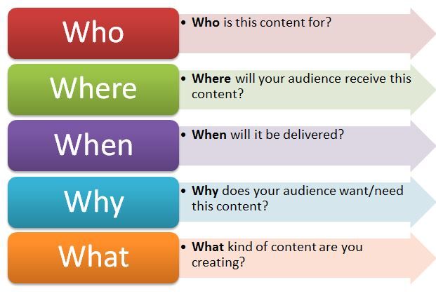
Here’s a handy reference that can be used for any type of content creation.
Deliver your message in a way that makes sense. Step away from your preconceptions of what your site should look like, and into your target audience’s collective consciousness. Why did they come to your site in the first place? What reasons might they have for visiting this particular page? What sort of information do they want to see first, and how do they want to see it?
Answer these questions on a case-by-case basis, and odds are the difference will be reflected in improved traffic volume, conversions and social interactions.
1.3 Analyse user requirements
According to usabilitypartners we can understand how and why will people use your product? What are the most important features for users? Which functions are most central? How should they be structured?
Know the users – understand their needs…

Common misconceptions about user requirements:“We thought we knew what they needed…””Users don’t understand the possibilities in the future. There’s no point in asking them…”
- Poorly specified user requirements are one of the most significant factors behind IT project failure.
- A successful product or system requires a proper understanding of both user and organisational requirements – we help integrate and balance the two in the specification process.
- Avoid over-reliance on internally generated requirements (what its believed that users want), as opposed to data from end-user requirements studies (what users actually need).
- Usability Partners support development projects, bringing key user data into the design process and analysing user needs, their work practice, and the situations in which they work.
User requirements gathering and analysis

Card sorting and Affinity diagramming workshops – two of several other techniques we use – particularly useful for information structuring (e.g. in navigation design)
The aim of our user-focused tools and methods is to provide a clear understanding of requirements as an early input to development projects. We help focus design work on those issues that are central to the success of a product or system in the eyes of the end-users.
Usability Partners is experienced with a range of requirements gathering and analysis techniques – we select those most appropriate to a given project situation. Whether end-users are professionals or consumers, located locally or around the globe, there are techniques for gathering their needs.
Typical requirements gathering and analysis methods include:
- Surveys – both open-ended and focused surveys, conducted electronically or on paper.
- Interviews – typically conducted face-to-face, but also over the telephone if deemed more appropriate.
- Focus groups – whilst being poorly suited to evaluating a product, focus groups are useful for discussing possible user requirements and brainstorming ideas.
- Field studies – observing the end-user situation and the environment in which a new product or system will be used is often extremely useful in understanding user needs.
- Evaluation of an existing product – provides a range of useful information (even competitor products can be tested). Usability evaluation reveals and clarifies good and bad aspects of current solutions – valuable input to new design work.
- Task analysis – a deeper analysis of users work with a system, useful for analysing how user’s work tasks should be supported by functionality in a system.
- User personas and usage scenarios – concrete and illustrative data about typical users, their characteristics, usage situation, tasks and goals. Particularly useful in supporting early user interface design work.
- Formulation of usability goals and overall design criteria – help focus and steer the design process, supporting the evaluation of early concepts, prototypes and final designs.
1.4 Evaluate the contribution of a website’s information architecture to the user experience
What is an Information Architecture?
Stavan Himal from the medium.muz claims that information architecture is all about organising the content in a way that it can be understood in an easiest manner.
In terms of digital design, information architecture is about organising the content of your websites, apps or software in a manner so that the users can understand and find the content they need and also help them to know where they are currently while using the service.
Information architecture means to divide a bunch of information into small pieces, labelling them and organising them in a way so that the information can be found easily and can be effective to use.
“Imagine yourselves as the architect, In this case, you create the blueprints of a site. You do the research and you organise the space based on the flow of people in and out of the building.”
It can be visualised as an intersection of the users, context and the content. As mentioned on Usability.gov, an IA can be referred as the ‘information ecology’ and visualised as a Venn diagram of users, context and the content.
Users: The audience, the people who are seeking information from your services
Context: In what terms you’re providing the information to your audience. Is it about the business goals, or about the technology or about the resources of how to create an IA
Content: As the name suggests, content means what are your providing them to read or access or to use. Are there some paragraphs of text, or the images or some videos or the quotes. Content is all about the value users are getting by using your service.

Defining IA as the intersection of Users, Context and Content using Venn Diagram
Why an Information Architecture is important?
In the field of digital design, information architecture can be mentioned as the back bone of the service you’re providing or it can be said that, an Information architecture is the foundation of the digital service and it helps to design the navigational context of your services and if the foundation is strong, the experience will be stronger.
The IA is the design of the information space to facilitate the intuitive access of the content.
How to create an Information Architecture and what are the common methodologies used in the process?
Some people relate the information architecture as part of library science and cognitive psychology or it can be said that an IA can be achieved through understanding the concept of Library Science and cognitive psychology.
Library Science
Library Science is mainly about categorising and cataloguing and we can use the same concepts while creating an Information Architecture. IA can be achieved by grouping (categorising) the pieces of content which are similar or the functions which has the same behaviour and later assigning them the values or the names (Cataloging) to find easily in the future.
Cognitive Psychology
Cognitive Science also plays a very important role in the creation of Information Architecture. There are many principles are involved in the cognitive psychology like,
Gestalt Principles
As per Interaction Design Foundation, Gestalt principles are the set of rules which describes that how our eyes perceives visual elements. They are used in creating optical illusions and some of the rules like principle of Similarity and proximity helps a lot to organise an information in a proper grouping and unified manner. To read more about this please refer to the article one Interaction Design Foundation.
Cognitive Load
While creating an IA, we always need to take care of the person who is going to use this information and how much information they can perceive or process in a given timeframe. It helps the Information Architects to design the information in a manner so that, they don’t provide a lot of information to the user at once.
Mental Models
Mental model defines that what user is already perceiving in his mind while reading or seeing a particular thing which is familiar to him. As per the article on UXBooth, ‘Information are easier to discover when it is in a place that matches the mental model of the user of where it should be’

For an example, while visiting a website of the company, user wants to know more about the company and from many website they would have seen, the information about the company generally lies in the ‘About’ page of the company which can be accessed by ‘About’ tab from the website.
Apart from these principles there are many other things like recognizing the patterns and the visual hierarchy which affects a lot to the mental model of the user about how they perceive the information and all these things should be taken care of while designing an IA.
How an IA is helpful?
“The goal is to create an easy experience that is engaging and instils a lasting impression on the user, It’s the difference between coming away from a digital experience and thinking “That was easy” to ‘Whoa. That was cool’.”
As I mentioned above, IA is the backbone of the digital service you’re creating. IA really helps to organize the content in a proper and easy way for the users to understand and at the same point of time, it helps to create the navigation and the hierarchy of the digital service.
As we all know, navigation is one of the most important component of the digital service we’re creating and the hierarchy as well. Good navigation menu helps people to move easily throughout the site and hierarchy helps to define the structure of the content. And so that, an IA is the most important part to decide that how the information is defined and accessed on a particular service.
Conclusion
As we are dealing with a lot of different types of content like text, images, videos etc. having a good IA is becoming more and more important to enhance the user experience of the service. If the content is well organised, the IA will be well prepared and it will ultimately enhance the experience of the users using your product. It is really important to think about every part of our web page and create everything as easy as possible. If customer see nice and clear web page probably will be there more time and if it is a shop he/she can spend more money. The point is to have attractive and easy web page.
References:
https://www.smashingmagazine.com/2008/01/10-principles-of-effective-web-design/– accessed on 24.01.19
https://www.impactbnd.com/blog/mobile-behavior-influence-on-website-design – accessed on 24.01.19
http://www.usabilitypartners.se/services/user-requirements-analysis.php – accessed on 24.01.19
https://medium.muz.li/information-architecture-and-its-importance-in-user-experience-design-e5c9c6ca80e9 – accessed on 24.01.19
 Digital Marketing Level 4